
在 D3.js 中创建工具提示
介绍
工具提示是设计师在用户将鼠标悬停或将键盘焦点放在元素上时逐渐向用户显示信息时可以使用的功能。在本指南中,您将学习两种通过实现工具提示来增强 D3.js 图表的方法。
本指南基于上一篇指南《在 React 应用程序中使用 D3.js》,该指南介绍了如何使用静态内存数据在 D3.js 中设置简单的条形图。在这里,您将使用工具提示扩展该条形图。
工具提示的两种方法
在 D3.js 中创建工具提示有两种可能的方法。第一种方法是将 SVG <title>标签创建为可交互元素的后代。第二种方法是使用mouseover、mosueleave和mousemove事件来动态移动和更改工具提示的可见性。第一种方法实现起来很简单,但可能会导致不必要地创建更多元素,从而影响性能。这两种方法都会得到演示。
使用标题 SVG 元素添加工具提示
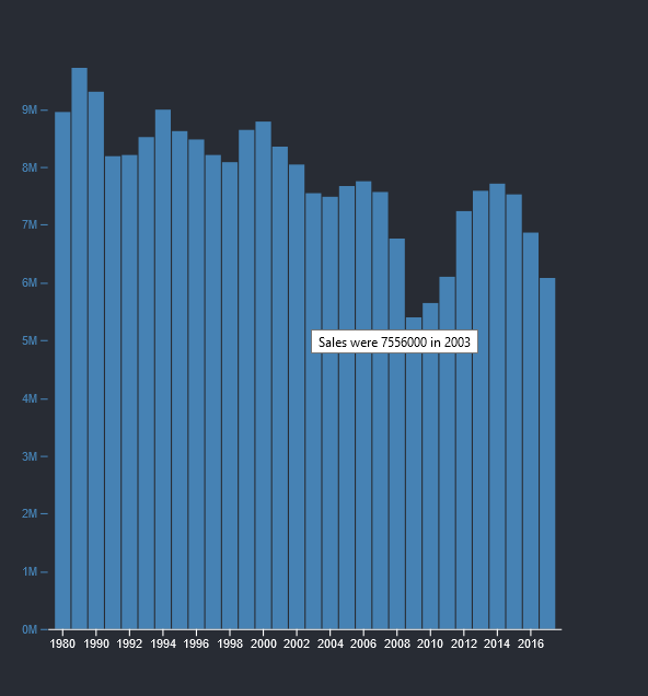
在React App 中使用 D3.js时,<BarChart />组件会根据销售年份创建<rect>元素。要添加简单的工具提示,您可以在可交互元素内插入<title />标签。这意味着 SVG 层次结构如下所示:
      <svg>
  <g class="plot-area">
  <rect class="bar" x="46" width="13" y="37" height="433">
    <title>Sales were 8949000 in 1980</title>
  </rect>
  <rect class="bar" x="60" width="13" y="-61" height="531">
    <title>Sales were 10979000 in 1985</title>
  </rect>
  </g>
  ...
</svg>
为了简洁起见,SVG 元素已经被简化。
要使用 D3.js 执行此操作,您只需对将数据连接到<rect />元素的代码进行少量更新。
      svg
  .select(".plot-area")
  .attr("fill", "steelblue")
  .selectAll(".bar")
  .data(data)
  .join("rect")
  .attr("class", "bar")
  .attr("x", (d) => x(d.year))
  .attr("width", x.bandwidth())
  .attr("y", (d) => y1(d.sales))
  .attr("height", (d) => y1(0) - y1(d.sales))
  .append('title')
  .text((d) => `Sales were ${d.sales} in ${d.year}`);
使用鼠标事件控制工具提示
第二种方法是使用mousemove、mouseleave和mouseenter事件来控制工具提示的可见性、样式和位置。这种方法需要更多代码,但可以为您提供更多控制权。使用此方法更新的<BarChart />组件如下所示:
      import { useD3 } from "./hooks/useD3";
import React from "react";
import * as d3 from "d3";

function BarChart({ data }) {
  const ref = useD3(
    (svg) => {
      const height = 500;
      const width = 500;
      const margin = { top: 20, right: 30, bottom: 30, left: 40 };

      const x = d3
        .scaleBand()
        .domain(data.map((d) => d.year))
        .rangeRound([margin.left, width - margin.right])
        .padding(0.1);

      const y1 = d3
        .scaleLinear()
        .domain([0, d3.max(data, (d) => d.sales)])
        .rangeRound([height - margin.bottom, margin.top]);

      const xAxis = (g) =>
        g.attr("transform", `translate(0,${height - margin.bottom})`).call(
          d3
            .axisBottom(x)
            .tickValues(
              d3
                .ticks(...d3.extent(x.domain()), width / 40)
                .filter((v) => x(v) !== undefined)
            )
            .tickSizeOuter(0)
        );

      const y1Axis = (g) =>
        g
          .attr("transform", `translate(${margin.left},0)`)
          .style("color", "steelblue")
          .call(d3.axisLeft(y1).ticks(null, "s"))
          .call((g) => g.select(".domain").remove())
          .call((g) =>
            g
              .append("text")
              .attr("x", -margin.left)
              .attr("y", 10)
              .attr("fill", "currentColor")
              .attr("text-anchor", "start")
              .text(data.y1)
          );

      svg.select(".x-axis").call(xAxis);
      svg.select(".y-axis").call(y1Axis);

      var tooltip = d3.select('.tooltip-area')
        .style('opacity', 0);

      const mouseover = (event, d) => {
        tooltip.style("opacity", 1);
      };

      const mouseleave = (event, d) => {
        // tooltip.style('opacity', 0);
      }

      const mousemove = (event, d) => {
        const text = d3.select('.tooltip-area__text');
        text.text(`Sales were ${d.sales} in ${d.year}`);
        const [x, y] = d3.pointer(event);

        tooltip
          .attr('transform', `translate(${x}, ${y})`);
      };

      svg
        .select(".plot-area")
        .attr("fill", "steelblue")
        .selectAll(".bar")
        .data(data)
        .join("rect")
        .attr("class", "bar")
        .attr("x", (d) => x(d.year))
        .attr("width", x.bandwidth())
        .attr("y", (d) => y1(d.sales))
        .attr("height", (d) => y1(0) - y1(d.sales))
        .on("mousemove", mousemove)
        .on("mouseleave", mouseleave)
        .on("mouseover", mouseover);
    },
    [data.length]
  );

  return (
    <>
      <svg
        ref={ref}
        style={{
          height: 500,
          width: "100%",
          marginRight: "0px",
          marginLeft: "0px",
        }}
      >
        <g className="plot-area" />
        <g className="x-axis" />
        <g className="y-axis" />
        <g className="tooltip-area">
          <text className="tooltip-area__text">aas</text>
        </g>
      </svg>
    </>
  );
}

export default BarChart;
您已执行以下必要的更改:
- 更新了jsx,包含一个工具提示区域组
- 创建鼠标悬停回调函数,使工具提示可见
- 为mouseleave创建了一个回调函数,当鼠标不再位于<rect />元素上时,该函数会隐藏工具提示
- 为mousemove创建了一个回调函数,当您在不同的<rect />元素之间移动时,它会重新定位并更新工具提示文本
您可能还想创建额外的元素来帮助您设置工具提示的样式。但是,这超出了本指南的范围。关于此方法的最后一点是,执行此操作的代码在 D3.js 的不同版本之间有所不同。上面演示的代码片段适用于版本 6。您可以在D3 6.0 迁移指南中了解有关更改的更多信息。
结论
工具提示可让您逐渐向用户显示更多信息。但是,它们并非总是解决数据呈现问题的良方。通过阅读这些工具提示指南,您可以详细了解应该和不应该如何使用工具提示。
免责声明:本内容来源于第三方作者授权、网友推荐或互联网整理,旨在为广大用户提供学习与参考之用。所有文本和图片版权归原创网站或作者本人所有,其观点并不代表本站立场。如有任何版权侵犯或转载不当之情况,请与我们取得联系,我们将尽快进行相关处理与修改。感谢您的理解与支持!


请先 登录后发表评论 ~